


Published at Jun 09, 2019 by NKumar
How to Interpret A Contour Plot
Too Long; Didn't Read
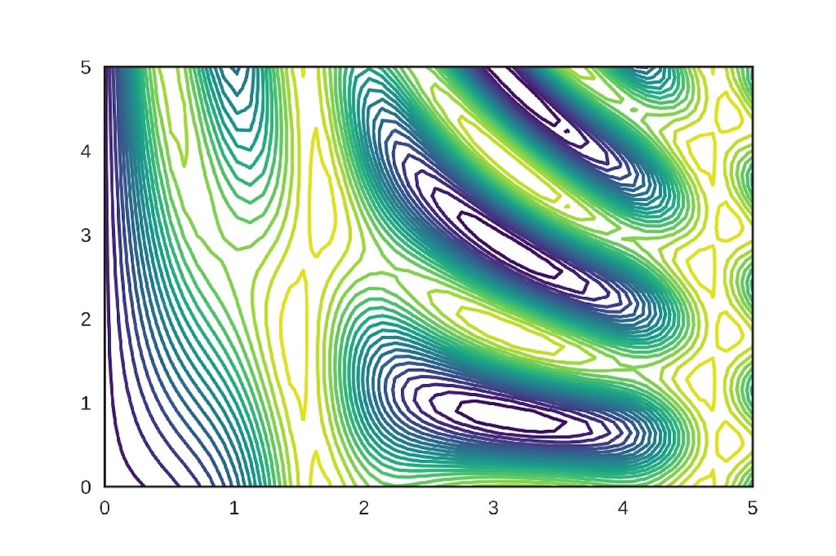
Contour map uses contours or color-coded regions helps us to visualize 3D data in two dimensions. Contour maps are also used to visualize the error surfaces in deep learning/machine learning optimization techniques like Gradient descent, Momentum gradient descent, Adam, etc… In this article, we will see how to interpret the contour maps and visualize the 3D Gradient ascent error surface using a contour map. The darker the shade of red indicates higher the loss value and darker the. shade of blue indicates lower the error value.People Mentioned
Companies Mentioned
Coin Mentioned
@NKumar
NiranjanKumarDeepLearning Enthusiast. Data Science Writer @marktechpost.com
Receive Stories from @NKumar
RELATED STORIES
Getting Started With Pytorch In Google Collab With Free GPU

Is There an AI Threat to Blue-Collar Jobs?
Published at Nov 22, 2023 by zacamos

Proxy Servers Evolve under the Rising Influence of AI and ML
Published at Nov 22, 2023 by vladimirfomenko

Interview with Petr Gusev: How To Manage an ML Team the Right Way
Published at Nov 21, 2023 by javierortega
ZKP Meets ML in Verifiability: Existing Scheme & Experimental Analysis
Published at Nov 20, 2023 by escholar

Zero-knowledge Proof Meets Machine Learning in Verifiability: Background
Published at Nov 20, 2023 by escholar
L O A D I N G
. . . comments & more!
. . . comments & more!